Part of the PEIQ Bias Dashboard is pictured below:
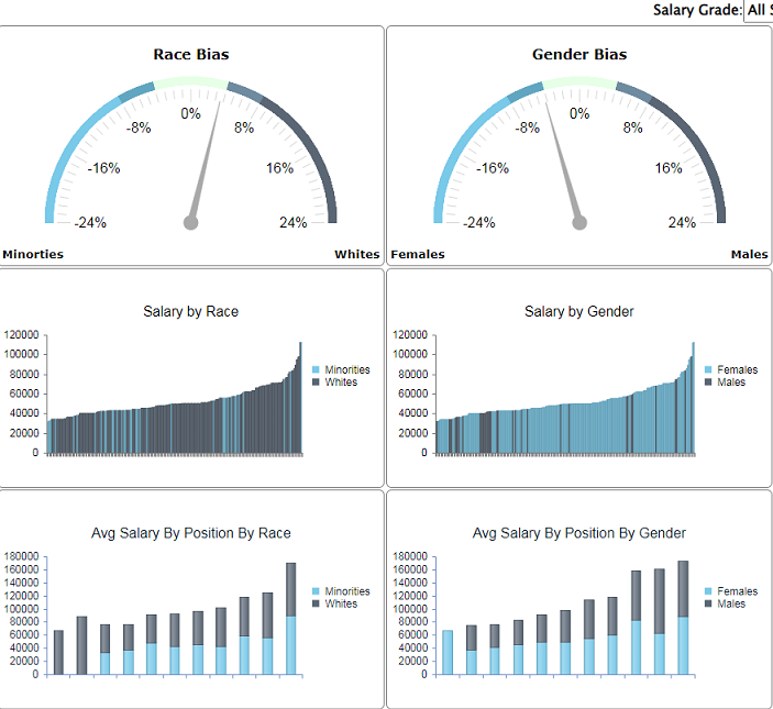 | | The PEIQ bias dashboard displays 4 columns of 3 charts, each column relating to one of the 4 PEIQ bias factors (race, gender, age, and ability). The first 2 columns are picture to the left. Each of the 3 charts in the columns are described below:
Bias Gauge (Top): The gauge gives an indication of whether any bias exists regarding the factor in question. The closer the gauge is to pointing straight up, the less bias that exists. Larger biases will point left or right to a degree representative of the size of the bias.
Annual Pay by Group (Middle): This chart shows, in incrementing order, the pay of each of the employees in the selected group, indicating to which group each employee belongs.
Avg Pay By Position By Group (Bottom): This chart shows the average pay per relevant position by each of the groups pertinent to that column's bias factor.
|