The PEIQ Contrast Dashboard is pictured below:
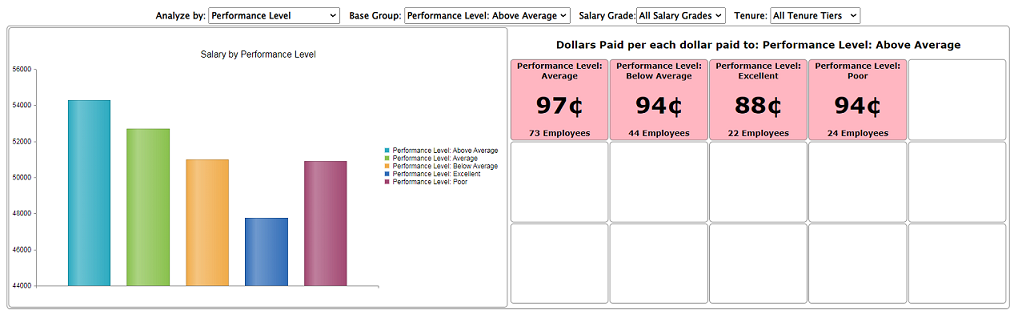 | | The PEIQ contrast dashboard provides a means of displaying the difference in pay between different groups, showing how much each group makes relative to one another.
Column Graph (left): This graph shows the pay of all of the pertinent groups from left to right, with a vertical, color-coded bar with height representing the average pay of the members of each group. In the example to the left, the groups, chosen by selecting values in the 'Analyze By:' drop down list, are performance levels.
Comparitive Pay Grid (right): Here the average amount of pay per dollar each group in the analysis receives for each dollar members of the base group receive (on average). The base group can be changed via the 'Base Group' drop down list.
|