Part of the PEIQ Plot Dashboard is pictured below:
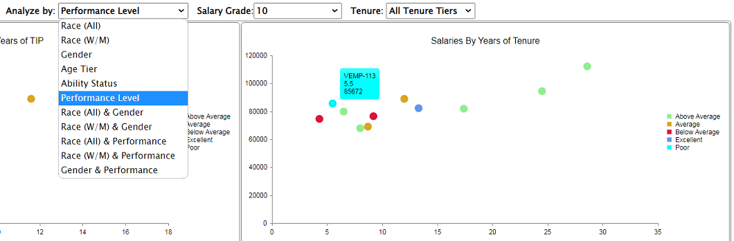 | | The PEIQ Plot dashboard displays 4 scatter graphs, each displaying the pay of the pertinent employees against one of the PEIQ time segments (Time in Position [TIP], Tenure, Experience, and Age). The dots in the graph are color coded by group to help identifier patterns, biases, and outliers.
X Axis: The X Axis represents the number of years of tenure of the employee.
Y Axis: The Y Axis represents the pay of the employee.
Color Coding: The color of each dot signifies to which of the relevant 'groups' the employee belongs. The groups are determined by the selection in the 'Analyze By' drop down list. In the example to the left, the employees are broken into their Performance Level groups. Note that moving your cursor over an employee 'dot' shows the employee ID, years of tenure, and pay.
|